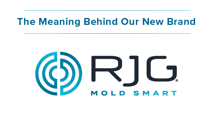
It felt like today would never arrive—the day we launch our new logo and brand we have been so excited to share with you! But here we are, and here is our new logo in all its glory.
It seems pretty simple, right? Not a lot to it, some circles, some new font, a few new colors. But we went through quite the process getting to this point, and we jam packed a ton of history and meaning inside that little icon. We’re going to take a moment to talk about why we chose to update now, our creative process, and the meaning behind the logo.
Why Update Our Brand Now?
We know what you’re thinking… we have been the same brand with the same colors and look since 1985, why change now when we have built up so much recognition? The answer is that we are not the company, with the same people, doing the same things as we were in 1985. And this is not the same industry, and barely even the same world.
We have evolved from being a consulting company, to being a training and technology provider, to offering injection molding businesses end-to-end, custom solutions. It was time our look evolved too. But it was vital that we didn’t lose the history and all that we have built behind our brand, so we wanted to tie in key existing elements with shiny, new ones.
Our Creative Process
Our process started a few years ago with extensive internal and external surveys so we could learn all about what our clients thought of us, what made us unique, and how we want to be perceived moving into the future. We took all of that feedback to heart to write our new vision, mission, and purpose statements that would drive our creative moving forward.
The next step was to update our logo, which carried a lot of meaning that we didn’t want to lose. For example, the swoop at the bottom of the original logo was the shape of our first in-cavity peanut-shaped sensor. We brainstormed how we could bring those elements over in a new, fresh, futuristic way. Then we played with our color palate to define an additional set of colors to use. Once our new brand was defined, we designed a new imagery style we thought would connect with clients on a human level.

Putting together all of these elements into one crisp, clean, easy-to-follow stylescape will allow us to efficiently stay on brand moving into the future.

The Meaning Behind the Logo
Believe it or not, this little icon is packed full of a ton of meaning. The initial design was inspired by the circuitry of our strain gage sensors, which are a staple in our technological offerings.
The brain shape represents people and knowledge, which is what sets us apart from the competition—our knowledge of the injection molding industry, the knowledge built into our systems, our support, and our passion for helping people succeed. The brain also ties into our tagline, Mold Smart.
The two halves represent a mold coming together.
And the three interlocking rings represent our three revenue streams: training, technology, and consulting.
![]()
The Future of RJG
We believe that this new look better represents the plans we have for helping bring the injection molding industry into the future. But don’t worry, even though we have a new coat of paint, our bones are still in tact. You can still expect the same, unprecedented global support and industry experience that we have always offered. We may just look better while doing it!
Check out our logo reveal video!

